Personal Project
Karigiri Kit — A Hand-Crafted Component Library
Karigiri is an Urdu word for craftsmanship — the kind that takes time, has an opinion, and shows in the details. Karigiri Kit is my personal component library built with that philosophy: every primitive ships with design tokens, keyboard navigation, and accessible markup out of the box.

Why build another component library?
I was three hours into customizing a component library when I realized I'd touched fourteen files and the button still looked wrong. That's when I stopped and thought: this is backwards.
Every time I picked up a library, I ended up fighting it. The component looked right in the demo, but the moment I needed it to match an actual product — real brand colors, a specific radius, a font that wasn't Inter — I was knee-deep in overrides, specificity wars, and a !important graveyard. The library was doing the easy part and leaving me the hard part.
And underneath all that CSS there was always a dependency I didn't ask for: Radix, Floating UI, some headless thing pulling in three more things. I wasn't using a component. I was inheriting a stack.
What fighting a library actually looks like
Here's a real example. You pick up a component library, grab their Button, and need it to match your brand. What follows is usually something like this:
// just making one button match your brand
const BrandButton = styled(Button)({
  backgroundColor: '#e63946',
  borderRadius: '6px',
  fontFamily: 'Inter, sans-serif',
  fontSize: '14px',
  fontWeight: 600,
  textTransform: 'none',
  padding: '8px 18px',
  boxShadow: 'none',
  '&:hover': {
    backgroundColor: '#c1121f',
    boxShadow: 'none',
  },
  '&.Mui-disabled': {
    backgroundColor: '#e4e4e7',
    color: '#a1a1aa',
  },
  '&.MuiButton-outlined': {
    borderColor: '#e63946',
    color: '#e63946',
    backgroundColor: 'transparent',
  },
});
// ...and then you repeat this for Input, Dropdown, Dialog...
So I asked a simpler question: what if the behavior was locked and correct, and literally every visual decision was a CSS variable? No config files, no design tokens pipeline, no rebuild. Here's the same result with Karigiri Kit:
/* four lines. every component updates at once. */
:root {
--kk-color-primary: #e63946;
--kk-radius: 6px;
--kk-font: 'Inter', sans-serif;
--kk-surface: #fafafa;
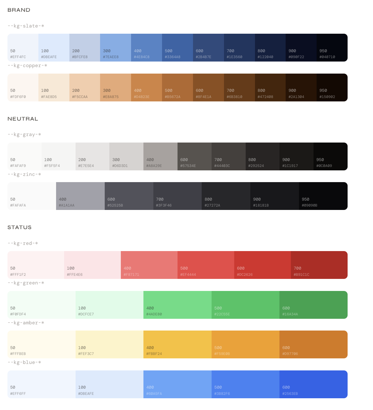
}No rebuild. No JavaScript. It works in a <style> tag. Buttons, inputs, dropdowns, dialogs — all of them pick it up. Under the hood, those four variables map to a full semantic token scale — slate, copper, gray, zinc, red, green, amber — so the library always has the right shade for every state without you having to think about it.
Where Karigiri Kit differs
Most libraries make a quiet assumption: that their look is your starting point. Karigiri Kit flips that. Behavior is hardcoded. Focus management, keyboard navigation, ARIA roles, loading states. These aren't configurable because they shouldn't be. A button that lets you click while it's loading isn't a design choice — it's a bug. That's solved once, in the library, and never again.
Appearance is the opposite: entirely yours. There's no theming API, no design tokens pipeline, no config file to learn. Just CSS custom properties.
Zero dependencies. Every interaction in this library is written from scratch in plain React — dropdown positioning, focus traps, scroll locking, keyboard navigation. No Radix underneath. No Floating UI. No headless library doing the invisible work. What you ship to your users is exactly what you see in the source.
That's not a flex — it's a choice about what you're actually signing up to maintain. If something breaks, you open the source and you find the answer. There's no third-party abstraction to chase down.
What ships with it
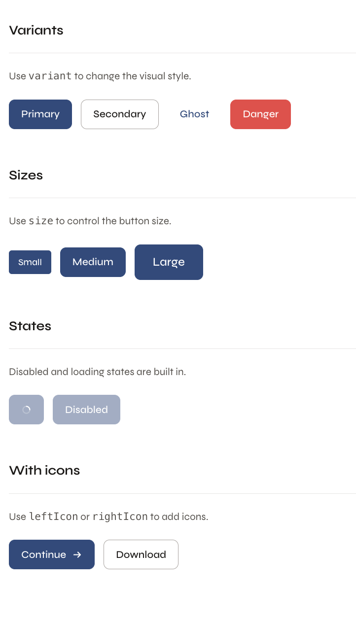
The current library covers the primitives that show up in every product:
- Button with loading + disabled states
- Input with error + helper text
- Textarea
- Dropdown keyboard navigable
- Dialog / Modal focus-trapped
- Badge
- Toast / Notification
- Tooltip
Status
On the way toward being open sourced. The demo and documentation are live — every component is interactive and the CSS variable overrides are documented alongside each one.